The art, science and philosophy of designing an intranet home page
A well-executed intranet is a powerful business tool, but designing an intranet home page can feel like an uphill battle at times.

Suzie Robinson is a digital workplace consultant at ClearBox Consulting and has responsibility for its suite of review reports. She has worked with intranets for 15 years and has practical experience with all aspects of an intranet lifecycle, from research to implementation, ongoing governance and overall strategy.
A well-executed intranet is a powerful business tool, but designing an intranet home page can feel like an uphill battle at times. Not only are there a lot of people to please, but departments across the organization are aware of how valuable that real estate is and so make late or unrealistic demands (that can be difficult to turn down).
Intranet home page design is therefore an art and a science, with a smattering of philosophy running through it too.
The art
Your intranet should be a window into the way your business thinks and operates. The best intranets represent the organization’s brand and cultural values in digital form. To put it another way, if you showed your intranet home page to a stranger, would they accurately guess the organization or, at least, your industry sector?
If your intranet is uninspiring, you risk people choosing not to visit at all or inventing costly workarounds. It’s therefore vitally important to appropriately reflect your company culture throughout the intranet. Your culture is reflected through topic choices, the way that content is written, and also through the look and feel of the intranet.
In turn, the branding of your intranet will significantly impact its look and feel. However, if your organization is comprised of multiple business brands or maybe locations with distinct identities, then having one intranet brand may be unwise. As with any branding then, it’s about more than colors and logos.
Also, if the overall impact of the intranet home page is dull or looks like it came from the 1990s then your branding might as well not exist. You need good technology powering your intranet branding to meet your business needs, and many intranet products approach this in different ways to help you do this appropriately.

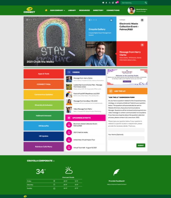
Crayola’s intranet (powered by Unily) clearly reflects its branding, while the cards on the home page show how important news (including video) and events are to people while giving quick access to key tools and information.
The Science
It’s likely you have some feedback from colleagues to draw on; if you’re at the start of an intranet project, you may have completed user research capturing people’s desires for the intranet. Alternatively, you may have the results from an all-employee survey detailing people’s frustrations with all aspects of the organization.
Or, more simply, you may have anecdotal feedback in the form of posts on social tools, water cooler conversations, or discussions from larger-scale meetings you’ve attended. Just make sure you capture it somewhere (and somehow) sensible!
Whatever the source, user research will highlight the areas that matter to the people across your organization, so you’ll know what to prioritize to meet those needs.
Another way to identify what matters to your colleagues is to review content performance via the intranet’s analytics. You could start small and consider news first before reviewing other data.
But what does good look like? It depends on a number of factors.
You’re best off benchmarking your performance against yourself and there are a number of questions you can ask to help identify whether your intranet news is successful or not. Using the associated answers you can shuffle, merge, or split news feeds and reconsider any audience targeting so that people see what matters to them. You may even want to consider how your intranet can be used as multiple channels, rather than one.
You can then use analytics alongside your user research to identify what other (non-news) areas are important to your colleagues, and therefore what should be on the home page. See below for a bit more on this, as it crosses over into ‘philosophy’.
However, one last area of ‘science’ that can support home page design is effective governance. Governance shouldn’t mean a mighty tome proclaiming “thou shalt not” – instead governance should focus on behavioral outcomes. This encourages people to think of ways to get those outcomes that rely not just on rules but on positive examples, subtle nudges, and making the right option the easy option.
Setting home page governance will help you as the home page manager too. If you have a clear set of guidance that you’ve shared with colleagues to set their expectations, you’ll feel confident in saying “no, please do this through X channel” to the last-minute charity bake sale request. The person making the request will also understand why you’ve said ‘no’, because your colleagues will realize your plans and philosophy for the home page…

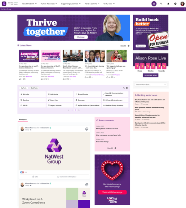
NatWest’s intranet (powered by Oak Engage) has a personalized news experience. People follow topics of interest and opt out of things that aren’t relevant, then the intranet adapts its targeting based on their interactions. Using algorithms, it reduces noise for employees and shows content in an order prioritized for the individual, giving everyone a personalized news feed, unique to them and based on their preferences. Introducing a targeted approach allowed NatWest to reduce the number of stories on its homepage and utilize the space more effectively.
The Philosophy
The findings in ‘art’ and ‘science’ will steer your home page design in certain directions. However, there are decisions to be made based on your expertise and understanding of the business, and its goals.
Organizational strategies and challenges will help guide the philosophy of your home page. For example, as a business are you trying to tackle talent retention? Showcasing the inclusive culture may therefore be important, so including feeds from the internal social spaces, or featuring a recognition tool on the home page might be (philosophically) more important than global news.
Identifying strategic guidance, top tasks and what people care about will therefore feed into the philosophy aspect of your home page design alongside the art and science. Combined, these will help you work out things like news topics / tags / channels, or what buttons should go where (or even be on the home page at all).
The final philosophical point I’d like to suggest is to just try things. Have your governance to hand but be flexible with it over time to address the changing needs of your business and intranet. Don’t hold onto a design that was right five years ago, as your business is probably very different now to what it was then.
For example, regular activities are a good place to start, such as performance reviews or quarterly compliance checks. You could investigate a few approaches on the home page to try ways to make these activities easier to see. For a quarterly audit you try deprioritizing home page elements as you feel appropriate and prioritize the compliance side of things, presenting it as a feed, a tick list, or something else. Then trial approaches with different groups, gather feedback, iterate, and roll out a solution the next quarter. Or, don’t trial it – work out a solution, share with relevant departmental contact(s) for feedback, then make the change.
Overall, your intranet home page should reflect who your organization and its people are, and meet the needs of the business and its people. Apply the art, science, and philosophy you uncover and simply know as an expert, and your home page design will be a success.

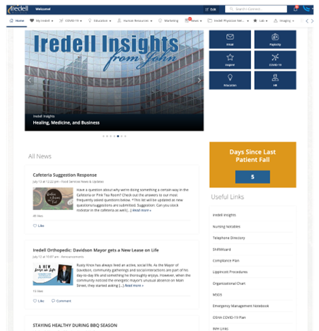
Iredell Health’s intranet (powered by Staffbase) shows some company news, but includes a ‘days since last patient fall’ block to highlight a topic that matters to the business. Buttons take people out to culturally important areas and tools too, such as ‘Paylocity’ and ‘Inspire!’. The intranet team understands its users and the home page matches the company philosophy.


