How you can use color theory to create better workplaces
Nobody wants to work in a small, red office. Color and design can play a crucial role in organizations’ efforts to entice their workers to return to in-person work.

Think about your favorite shirt to wear to the office (or on your daily Zoom calls). What color is it?
Does it make you feel powerful, confident? Perhaps you like this shirt because you feel it makes you appear approachable and friendly.
Interior designers use color in a similar way, to make spaces feel inviting, clean, exciting or calming. And color theory, defined as “the collection of rules and guidelines which designers use to communicate with users through appealing color schemes in visual interfaces,” is becoming increasingly important in designing offices and other workspaces.
Color theory at work
According to architecture and design firm Hammel, Green and Abrahamson’s (HGA) guide on using color theory in workplace design, being intentional about which colors you deploy in each space can encourage deeper social connections, improve learning and foster more collaboration.
“Workplace strategy is developed in association to a company’s culture, symbolism, and personality,” the post reads. “The rules of colors and combinations can be applied to workplace design and provide a full spectrum of options, each having an important impact on people and their perceptions.”
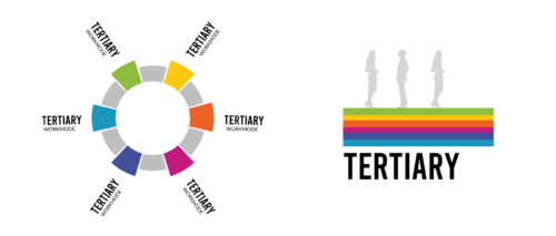
HGA’s guidelines suggest using primary colors (red, blue, yellow) for “heads-down workspaces” like focus rooms or individual workstations; secondary colors (green, orange, purple) for smaller collaborative spaces like group workstations; and tertiary colors (red-orange, yellow-orange, yellow-green, blue-green, blue-violet and red-violet) for larger collaborative spaces like conference rooms or staff lounges.

The relationship between color and workplace design
Color psychology is also present in the design of most workplaces. And as many companies incentivize their workers to return to the office, some are considering redesigning their workspaces to be more inviting.
“Companies looking to improve their businesses should seek opportunities that incorporate nature as part of their color palette—whether that’s through movable pods, indoor planters, green walls, or increasing access to sunlight and the sky,” writes architect Irene Lok for Fast Company. “It’s also important to consider the activities and specific needs that will take place within any given space.”
Lok notes that good workplace design prioritizes color associations, or how colors make us feel, rather than the purely visual appeal of colors.
Udo Schliemann, principal creative director with environmental graphic design firm Entro, writes in a piece for Work Design Magazine that color can also be used to make workplaces more accessible.
“This is especially pertinent in wayfinding and signage, where high color contrasts must be chosen carefully to ensure the maximum amount of visibility for users, especially those that have impaired vision,” he writes.
How workplace design affects employee experience
As employees ponder their return to the office, designing inviting workspaces isn’t an à la carte option for certain companies — it’s an essential part of the employee experience.
Sam Souccar, senior vice president of creative with hospitality company Restaurant Associates, says companies looking to mold their updated workplaces to better fit the wants and needs of employees should look to the data.
“Research has shown that employees seek purpose, social interconnection, recognition, flexibility and opportunities for growth,” says Souccar. “There’s a renewed expectation for their personal sense of purpose to align with that of their employer. They are motivated by the feeling of being part of a collaborative team where they can feel at ease bringing their authentic self.”
What do those values mean to workplace designers? Souccar says it’s about giving company values tangible attributes.
“Whether it’s an inspiring lobby experience, time-saving amenities, strain-reducing lighting, ergonomically-correct work stations, stress-reducing biophilia, or inviting social hubs, space design can significantly impact the physical translation of the company values and the morale and productivity of its workforce,” he says.
Who owns workplace design?
Identifying where your company falls short in the design of its workspaces is the first step, but narrowing down who should be responsible for design strategy moving forward is key to a successful interior revamp.
In most organizations, workplace design would likely fall under the purview of whichever department oversees employee experience. But it speaks to a larger issue at hand for many companies: Who owns employee experience? Is it human resources? Internal comms? Or perhaps it’s a new department altogether?
Gallup defines employee experience as “the sum of all interactions an employee has with an employer, from prerecruitment to post-exit.” Given this definition, it’s likely that most employee experience strategies involve some level of cross-departmental collaboration.
Souccar notes the multifaceted nature of employee experience, writing, “The new employee experience is one of belonging where tailored, authentic experiences can amplify a sense of purpose, energize engagement, and propel performance.” Sounds like this responsibility could fall to any number of people in an organization.
Color your workforce engaged
If your company could benefit from a workplace revamp, color is often the easiest place to start.
Consider working with your HR department and an interior designer to create a palette that speaks to what your employees want — if they report being stressed out or frenzied, consider muted blues and neutral beige to help create a soothing environment. If your workers say they lack inspiration, try pops of yellow or orange.
A few cans of paint (and maybe some office plants) can work wonders on an otherwise bland space.
Souccar identifies four emerging workplace redesign trends that could be easily implemented with some creative thinking:
- Protection to connection. This concept leans into the comforts of home and family. Souccar suggests using easily cleanable surfaces and reimagined common spaces to emphasize collaboration and ease of use. Colors often used in kitchens or living spaces at home would work in this setting.
- Integrated digital experiences. This concept speaks to our newly heightened awareness of the spread of germs and illness following the pandemic. Mobile ordering for in-office dining and automated check-ins and wellness screenings are two examples of this. Blues and whites would further emphasize cleanliness with this trend.
- Flexibility is key. Here, employees would have extended access to outdoor green spaces, adaptable seating and thoughtful digital signage, making moving around the workspace as easy as possible. Green evokes thoughts of nature and idyllic peace — use it to bring the outside in with this trend.
- “At one’s fingertips.” Convenience is the name of the game for this trend, characterized by convenient, 24/7 access to work spaces and equipment, seamless amenities and wellbeing experiences. With so much going on in this trend, stick to muted colors like warm grays.
If workplace redesign is part of your company’s return-to-office strategy, make sure you highlight the changes to returning workers and potential new hires. Commitment to your employees’ comfort in the office could mean the difference between a plummeting retention rate and employees who look forward to coming in to work every day.


