5 ways to immediately improve your intranet
Take these steps to quickly refresh your hub—and boost employee engagement.

Is your intranet getting stale?
When you’re as close to an intranet as many internal communication managers are, it can be hard to see when your site is losing its luster. However, employees have no such problem. Their lack of engagement will quickly let you know when your site has lost its appeal.
It’s essential to listen to employee feedback and realistically assess how your intranet looks now compared to what else you see online. If your gut tells you that it’s dated, others probably agree.
Luckily, you can efficiently and effectively update your intranet design to make an impact on both employee interest and engagement. The following design gems, discovered over the course of many intranet design projects, can help you achieve meaningful results in a matter of hours:
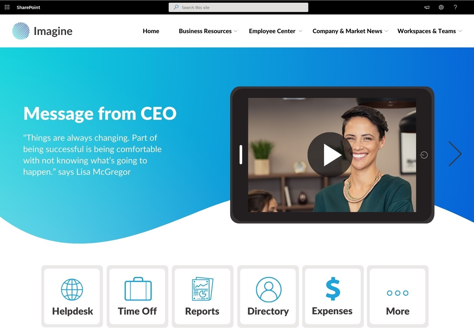
1. Place quick links at the top of the page.
Thirty-nine percent of employees we surveyed say they particularly appreciate easier navigation to the applications they use most frequently. Unfortunately, many organizations have their intranet page set as a browser’s home page, something that is established by IT and often cannot be changed. That’s why the homepage must have the key information where it is easy to find and access.
Here is an example of the homepage header that shows how you can combine news and quick links. Though this design showcases SharePoint intranet examples, the principle applies to any intranet platform.

2. Reduce the number of news articles on a homepage by using news targeting.
Employees do enjoy news articles that are timely and relevant. However, a large volume of news on the page can be overwhelming and reduce clicks and engagement.
You can keep the news relevant by targeting articles to employees based on their division, location or job role. With modern intranet tools, this employee information is already set in the user profile, so you simply need to target news to a specific employee segment.
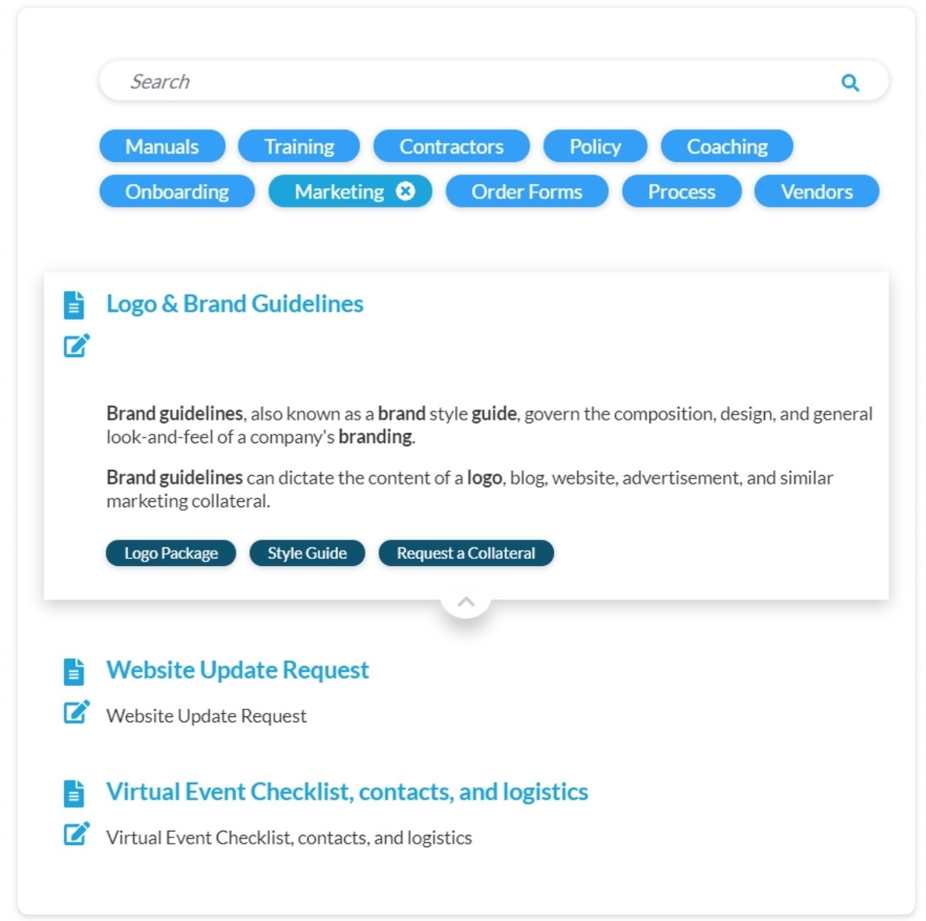
3. Give employees what they want: a one-stop shop of crucial resources.
When we recently surveyed employees about their top intranet requirements, 41% of respondents said they need a way to quickly find forms, templates, policies and procedures and other crucial work resources.
This doesn’t mean your homepage should be cluttered. Here is an example of the resource directory our customers are using that houses all of these resources as a one-stop shop.

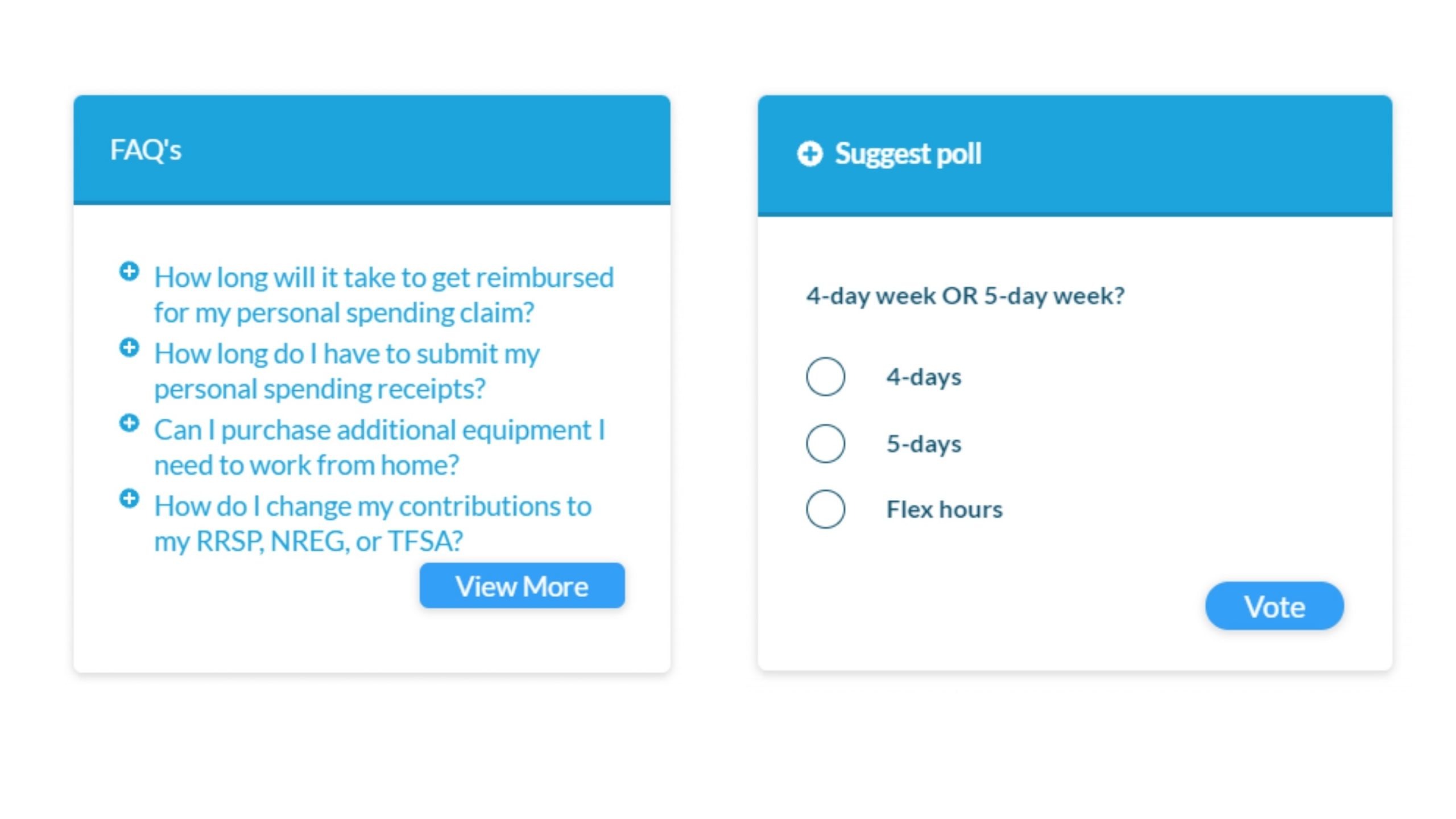
4. Add more interactive elements such as polls, FAQs and videos.
Social engagement helps bring employees together and builds a sense of community. Employees appreciate when they’re asked for feedback and can see what their colleagues think. Simple and frequent polls, such as the following, can work wonders for your intranet engagement.

Polls can also provide actionable information for your intranet strategy or for your company as a whole—or they can simply be a fun tool to uncover employee interests and preferences. Likewise, multimedia content, such as videos and podcasts, offer a fun option for increasing engagement and connecting with employees on a deeper level.
5. Add white space and reduce distraction by removing unnecessary and static images.
At some point, everyone involved with a company intranet has been guilty of trying to overdesign pages with images. In this case, a little goes a long way.
When our customers ask us to redesign their sites, we start by looking at the scroll depth of their existing pages. We often see that large, static images, such as banners, get scrolled past as if they didn’t exist. That’s precious real estate wasted. Instead, add more white space and background to separate elements on the page to create a clean, fresh look and feel.
Each of these five tips are easy to implement and can make a noticeable difference on your intranet. Like what you see? Share these simple and timeless design principles with your team and colleagues.
Yaroslav Pentsarskyy is a digital workplace advisor at ORIGAMI, which provides innovative, pre-built SharePoint intranets that feel like it’s been made just for you.
This article is in partnership with ORIGAMI.


